
In between finishing up my database coursework, I’m usually doing remote sensing work.
Most of what I’ve been working on lately is an attempt to create crop phenology curves. In a nut shell phenology curves are just a measurement of crop growth throughout the year.
This post is just a quick code-along which shows you how to generate phenology curves using R.
I’ll try to always list any packages or addins I use so that if anyone else stumbles across this, they know what I’m using. Nothing’s more annoying than orphaned functions and having to hunt down packages. Also the link to download the data is public so it should be available to play around with as well.
library(dplyr)
library(magrittr)
library(readr)
library(knitr)
library(kableExtra)
The Data
This past weekend I spent some time writing a python script (more on this later) that calculated the average NDVI value for a few thousand fields in the Mississippi Delta region for 20 discrete days in 2000. NDVI stands for Normalized Difference Vegetation Index - a measurement of vegetation health. The Delta is one of the most agriculturally productive regions in the country, which makes it a good target if we want to look at crop growth over time.
# Read in NDVI data
ndvi_stats_2000 <- readr::read_csv('https://www.dropbox.com/s/rvqgnxc70gv4bhl/ndvi_stats_2000.csv?dl=1', guess_max = 10001)
You might be wondering what guess_max = 10001 is for. By default readr tries to guess the data type by reading the first 1000 rows. Since I’ve looked at our raw data table before hand, I know that the first few thousand rows are actually no data values represented by ‘0’. This misleads readr to assume incorrect data types resulting in data integrity issues.
The next thing I wanted to do was filter crops into their own tables based on their crop IDs. These identifiers correspond to the respective identifiers from the Crop Data Layer - a really handy land-cover dataset provided by the USDA.
# Filter by crop type
corn <- filter(ndvi_stats_2000, ndvi_stats_2000$cdl == 1)
cotton <- filter(ndvi_stats_2000, ndvi_stats_2000$cdl == 2)
rice <- filter(ndvi_stats_2000, ndvi_stats_2000$cdl == 3)
soybeans <- filter(ndvi_stats_2000, ndvi_stats_2000$cdl == 5)
fallow <- filter(ndvi_stats_2000, ndvi_stats_2000$cdl == 61)
This particular dataset has quite a few no data values due to clouds. Before we can proceed we need to mask out these values.
# Filter out no data
corn <- filter(corn, corn$avg > 0)
cotton <- filter(cotton, cotton$avg > 0)
rice <- filter(rice, rice$avg > 0)
soybeans <- filter(soybeans, soybeans$avg > 0)
fallow <- filter(fallow, fallow$avg > 0)| field_id | doy | avg | max | min | range | std | count | area | cdl |
|---|---|---|---|---|---|---|---|---|---|
| 4369 | 84 | 2257.465 | 3953 | 0 | 3953 | 807.3354 | 101 | 90900 | 1 |
| 4746 | 84 | 1635.798 | 3673 | 0 | 3673 | 549.2867 | 327 | 294300 | 1 |
| 82 | 20 | 3218.348 | 4946 | 0 | 4946 | 755.9517 | 164 | 147600 | 1 |
| 124 | 20 | 6144.165 | 7483 | 0 | 7483 | 572.2665 | 176 | 158400 | 1 |
| 197 | 20 | 2235.016 | 4798 | 0 | 4798 | 599.0628 | 183 | 164700 | 1 |
| 247 | 20 | 4121.549 | 7234 | 0 | 7234 | 1424.5496 | 268 | 241200 | 1 |
The Analysis
First we need to group by the day of year an image was collected. Then for each snapshot in time we can calculate aggregate statistics for each crop. What was the mean average NDVI value for every field growing corn on the 4th day of the year for instance.
# Calculate stats on cleaned data
corn %>%
  group_by(doy) %>%
    summarise(average = mean(avg), maximum = max(avg),
              minimum = min(avg), stdev = sd(avg) ) -> corn_stats

cotton %>%
  group_by(doy) %>%
  summarise(average = mean(avg), maximum = max(avg),
            minimum = min(avg), stdev = sd(avg) ) -> cotton_stats

rice %>%
  group_by(doy) %>%
  summarise(average = mean(avg), maximum = max(avg),
            minimum = min(avg), stdev = sd(avg) ) -> rice_stats

soybeans %>%
  group_by(doy) %>%
  summarise(average = mean(avg), maximum = max(avg),
            minimum = min(avg), stdev = sd(avg) ) -> soybeans_stats

fallow %>%
  group_by(doy) %>%
  summarise(average = mean(avg), maximum = max(avg),
            minimum = min(avg), stdev = sd(avg) ) -> fallow_stats

# Gather stats
crops <- list(corn_stats, cotton_stats, rice_stats,
              soybeans_stats, fallow_stats)
crop_names <- c('Corn','Cotton','Rice','Soybean','Fallow')
par(mfrow=c(2,3)) # all plots on one page
Now if we want to plot our aggregated averages, we can use a simple for loop to produce a plot for each crop.
c <- 2
for(i in 1:length(crops)){

  crop <- crops[[i]]

  heading = crop_names[i]
  plot(x=crop$doy, y=crop$average, ylim=c(1000, 8500), type="l",
       main=heading, col = c, xlab = 'Day of Year', ylab = 'Mean NDVI')
  lines(x=crop$doy, y=crop$average, type="l", col = c)
  c <- c + 1
}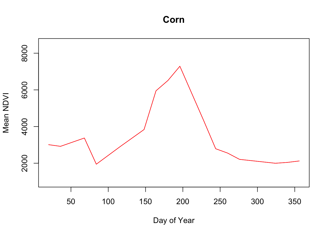
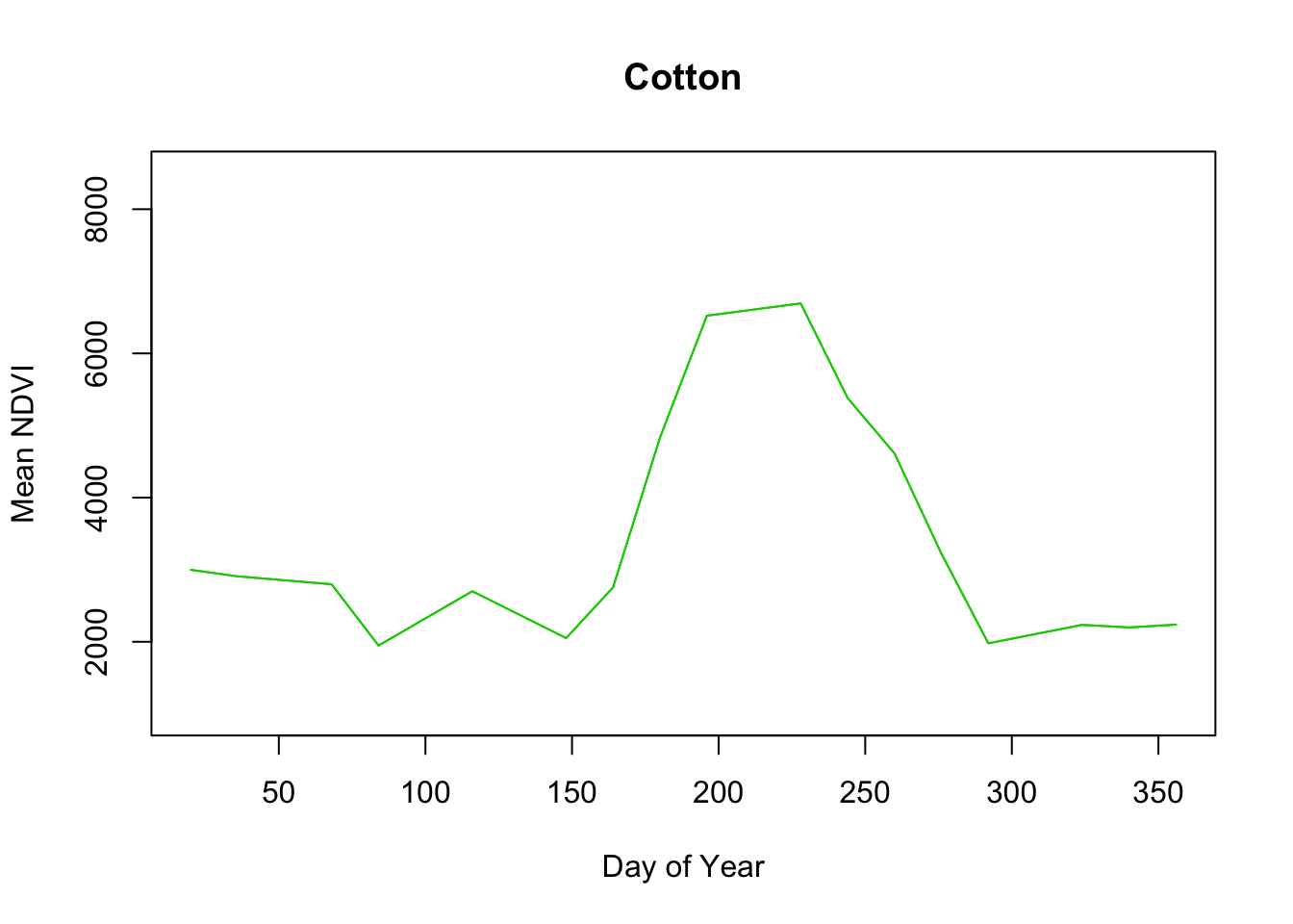
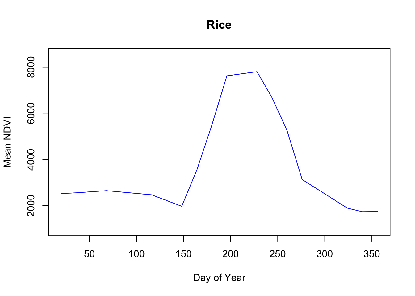
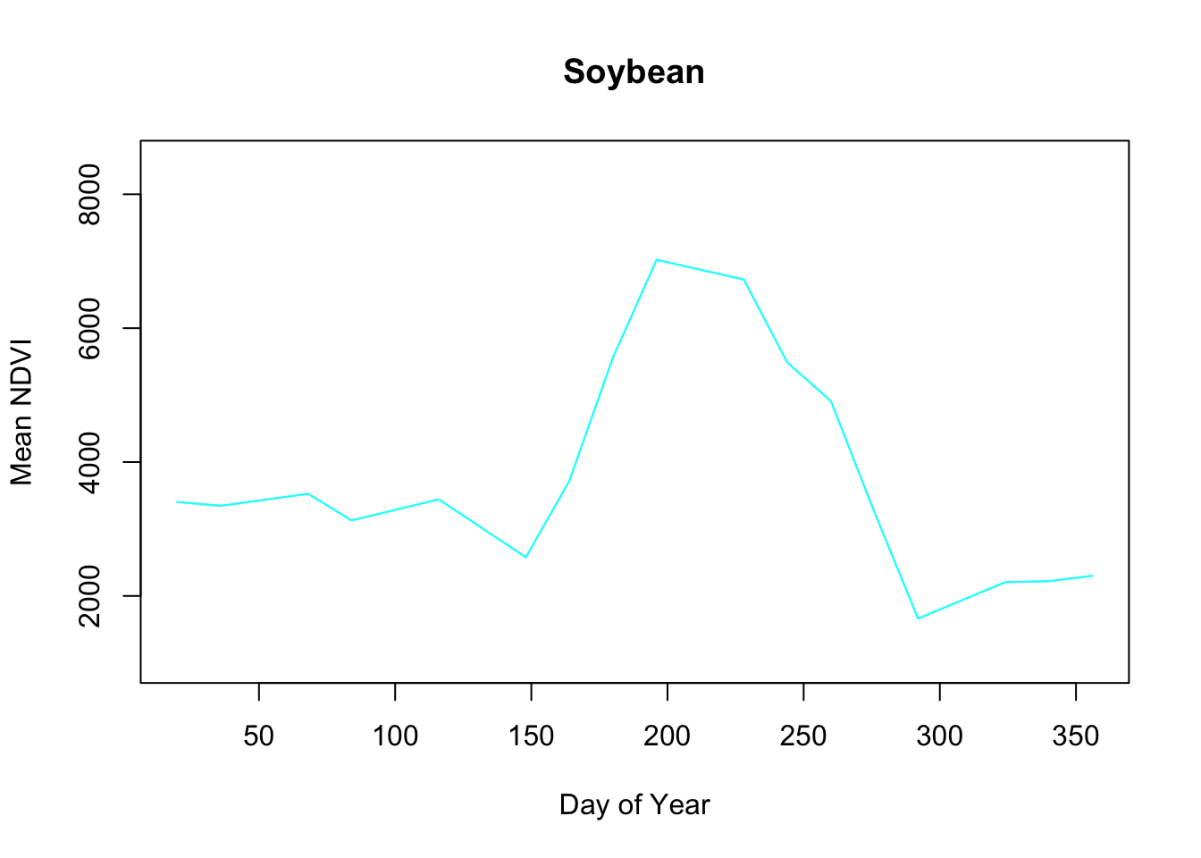
 Pretty neat.
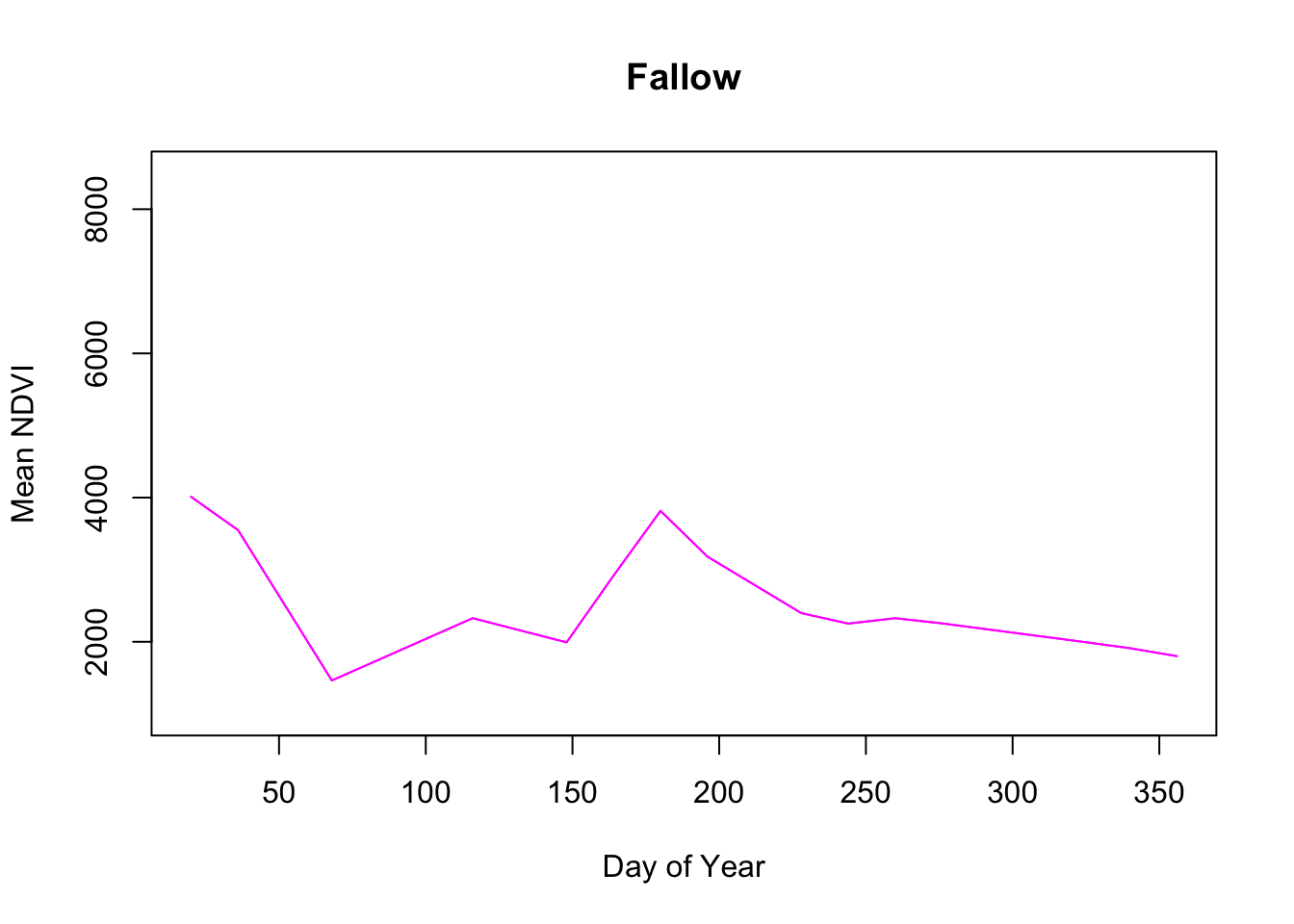
Immediately the Fallow phenology curve stands out, with little response during the year which shouldn’t be surprising since these fields are idle.
Interestingly Cotton and Rice seem to have similarly shaped curves. Rice has a higher plateau near 8000 versus cotton which looks to be closer to 7000. According to the USDA Agricultural Statistics Board, the usual plant date for Mississippi cotton is April 14 and the harvest date ends by November 13. Rice planting starts April 2 and the harvest is typically complete by October 27.
So there’s definitely overlap in their production schedules. My initial thoughts are that the density of the rice plants and consistent irrigation might contribute to the high rice NDVI values as opposed to cotton which may or may not be irrigated depending on the farm thus lowering the overall NDVI average for cotton.
Eventually the idea is to use these phenology curves as references for historical crop classification of NDVI images from before 2000 when field scale crop landcover data doesn’t exist.